Data visualization in user experience design
We live in an era where data floods every corner of life. From health-tracking apps to business dashboards, users are constantly exposed to numerical information.


1. What is data visualization?
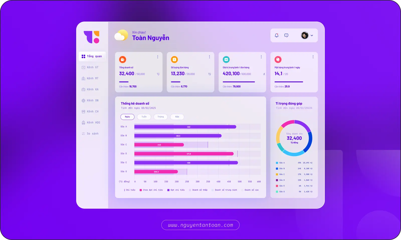
Data visualization is the process of turning numerical data into visual forms such as charts, graphs, maps, or infographics. The goal is to help users grasp information quickly, spot trends, and make accurate decisions.
From charts, tables, graphs, and maps to diagrams and infographics, each format has its own strength. Some are good for comparison, some show relationships, and some emphasize trends or distribution. Choosing the right type of visualization does more than present data effectively. It also helps shape the user experience, from an admin dashboard to a health-tracking app or a product report.
For example, a line chart can show revenue growth over time, while a heatmap can reveal the areas of a web page where users interact the most.
2. Why does data visualization matter in UX/UI design?
The human brain processes images faster than text. Presenting data visually helps users understand information more quickly and more accurately.
In a digital product, showing users all the data is not enough. Put yourself in the viewer's seat: data has to be organized strategically, leading users to the insight that matters and supporting their decisions. A well-timed chart or a well-designed dashboard can say more than hundreds of lines of text and figures, and that is the edge held by products that know how to tell stories with data. Data visualization is critically important for the following reasons
2.1 It helps users understand information faster
The human brain processes images faster than text. Presenting data visually helps users understand information more quickly and more accurately.
2.2 It improves the user experience
Data visualization makes it easy for users to notice trends, relationships, and anomalies in the data without having to dig into deep analysis.
2.3 It supports data-driven design decisions
Heatmaps and funnel analysis help designers find bottlenecks and optimize real user flows.
2.4 It makes your solutions more persuasive
Tools such as heatmaps or user behavior analytics provide deep insight into how users interact with the product, which helps designers optimize the interface and the user flow.
3. The history of data visualization: from clay tablets to smart dashboards
As mentioned above, data visualization is the art of turning data into images, taking dry numbers and making them into information that is easy to understand, easy to remember, and easy to act on. It does more than clarify what is happening. It also opens up a deeper view of the bigger picture.
Interestingly, data visualization is not a modern invention. Clay tablets inscribed with symbols by the ancient Sumerian civilization, more than 4,000 years ago, were once used to record and keep track of silver. More than 4,000 years ago, the ancient Sumerians were already carving symbols into clay tablets to track the silver and goods they traded. Those symbols were not just for remembering but for "seeing", for managing finances and communicating information. This is considered one of the most primitive forms of data visualization.

The turning point came in the 17th century, when science and data began to intersect in earnest. Fields such as mathematics, astronomy, geography, and statistics each produced tools for representing data visually: line charts, heat maps, scatter plots, network diagrams, and more. From this point on, we were no longer just writing about data. We had started to "draw" it.

The 20th century saw the rise of the computer. With the ability to process data quickly and accurately, visualization entered its digital phase. From simple charts in Excel to complex dashboard systems on BI (Business Intelligence) platforms, data was no longer merely presented. It was designed to update in real time.
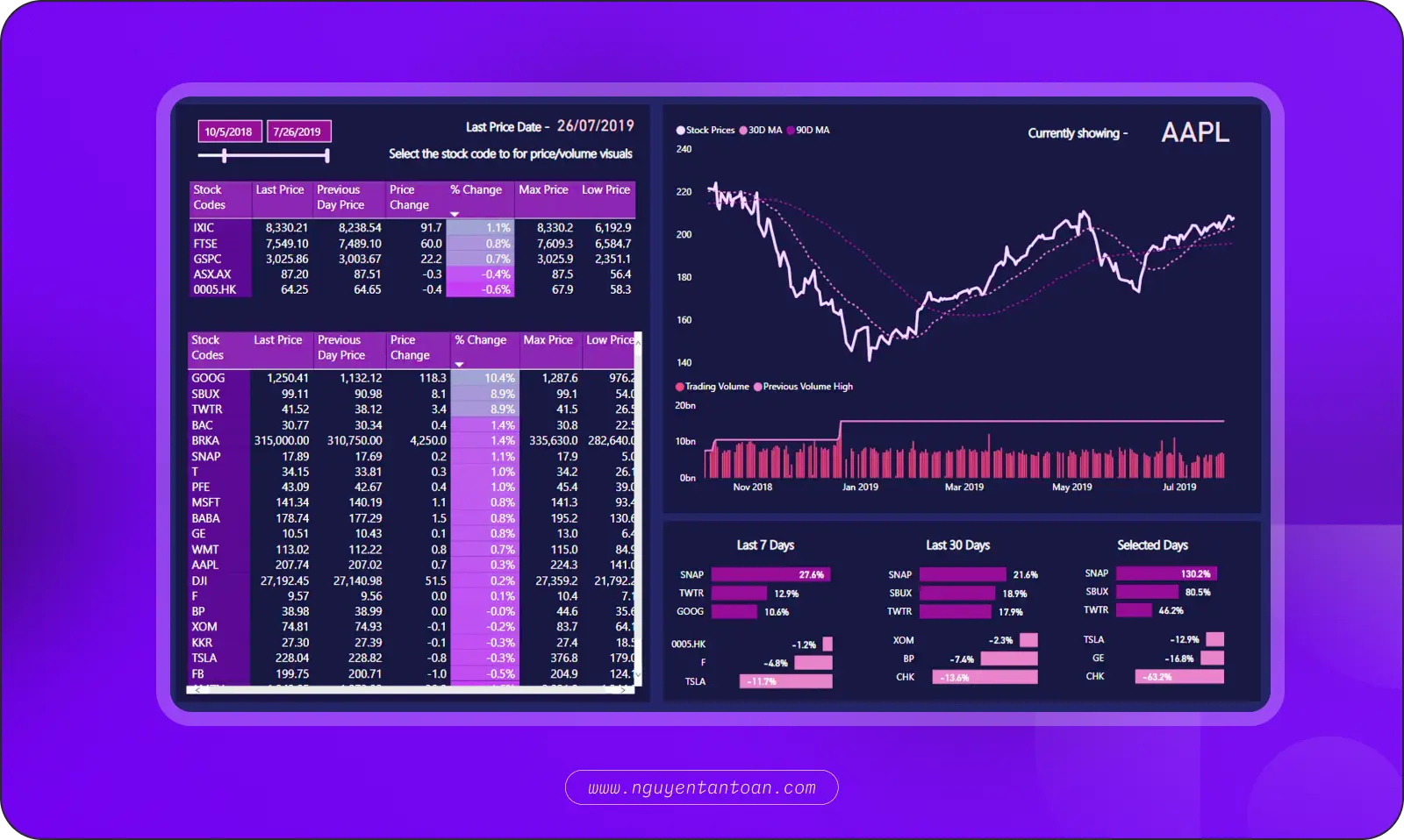
Today, data visualization is the right hand of business strategy, product design, organizational management, and personalized user experience. With big data and AI on the rise, the role of visualization is no longer supporting. It is central. A well-designed dashboard does not just display information. It guides the eye, highlights what matters, reduces cognitive load, and builds confidence in decision-making.
You could say data visualization has evolved from a tool into a language. This language uses shapes, not words. It tells its story through insight, not sentences. And if you want your product to be understood, trusted, and acted on, you need to learn to speak that very language.
4. Useful principles for visualizing data in UX/UI design
Data visualization is not just "drawing pretty charts". It is the art of turning raw data into a meaningful experience, helping users see what matters, understand it quickly, and act correctly.
4.1 Know exactly who your users are
Don't design charts for "everyone". Understand who your users are, what role they play (manager, operations staff, customer, and so on), what their goals are, and what information they need to make decisions.
4.2 Understand the business - understand the context of the data
No data "speaks for itself". Designers need to understand the business domain, the operational logic, and the decision-making process behind the data to know what to show, what to drop, and what to highlight.
4.3 Convey the right message
Every chart must answer a specific question. If you cannot state clearly "What does the user need to know here?", that data does not need to be shown yet.
4.4 Simple, but with a clear focus
Choose familiar, intuitive charts (bar, line, pie, and so on) to make them easier to take in. Avoid being so creative or complex that viewers lose time decoding what they see.
4.5 Add interactivity - when it fits
Tooltips, filters, drill-downs, and segmentation let users explore deeper on their own according to their individual needs, without overloading the interface.
4.6 Optimize for every device
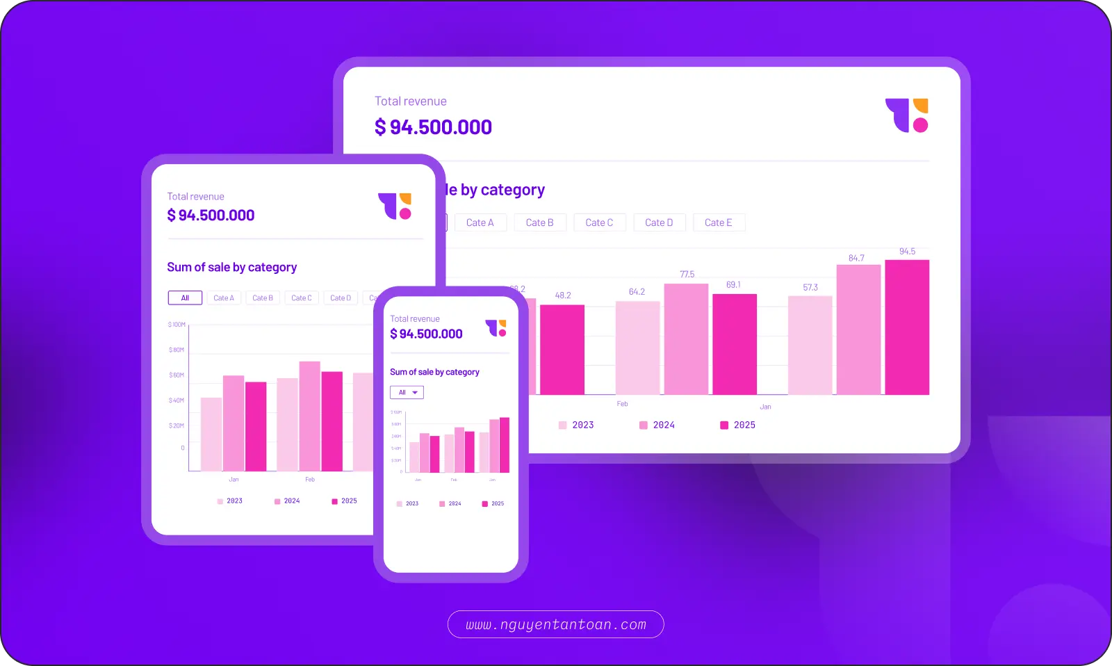
Data does not live only on the desktop. A good chart has to be clear, readable, and easy to interact with on tablet and mobile.
5. The challenges of combining data and user experience (UX)
Combining data visualization and UX is not a matter of "adding another chart". It is a strategic design problem that calls for careful weighing of trade-offs. Here are 4 common challenges:
5.1 Information overload
One of the biggest challenges in data visualization is presenting complex data sets in a way that is easy to understand and visually appealing. If you present too much data at once, it can become overwhelming and hard to interpret, which defeats the purpose of visualizing it. UX designers have to strike a balance between providing enough meaningful data and not overwhelming users.
5.2 Compatibility in design
Data visualization and user experience each require distinct skills and knowledge. Integrating the two can be a challenge, because designers have to understand how to convey data effectively through visual cues while keeping the user experience seamless and intuitive.
5.3 Bias
Data visualization can be affected by the biases of the team building it. For example, if UX designers have a specific, preconceived notion of what the data will look like, they may present it in a way that supports that bias instead of reflecting the data accurately. UX designers have to be aware of this risk and work to remove bias from the design process.
5.4 Technical limitations
Combining UX design and data visualization can also be technically challenging. Making sure the available technology and infrastructure can support both the design and the data visualization effectively can be a complex task. It takes collaboration between the relevant departments, including designers, software engineers, and data science engineers, to make sure the final product meets the needs of all stakeholders.
6. Building a UX design strategy that works with data visualization
Combining data visualization and UX is not a matter of "adding another chart". It is a strategic design problem that calls for careful weighing of trade-offs. Here are 4 common challenges:
6.1 Information overload
First, you need to define the goals and purpose of the project. Identify which data is truly necessary and helps the viewer achieve their goal. This gives the design process direction and ensures the final product is relevant and useful.
6.2 Analyze user needs (user-centric design)
Understanding your specific audience is crucial to creating an effective design. Conduct user research to gather information about users' needs and goals, then use that information to inform the design process.
6.3 Information overload
Visualization needs accuracy. UX needs simplicity. Designers have to know how to represent complex data in a way that is visual and easy to understand without losing credibility or hurting the user experience. If too much data is shown, users can no longer see anything important. The design has to prioritize the order of information, reduce noise, and show only data that carries actionable value.
6.4 Choose the right chart for the data
Create a prototype or a test version to check how the visualization and the user experience work in practice. This lets you adjust and improve the design before rollout.
6.5 Create a prototype
Designing a beautiful chart is one thing. Getting it to render in the real product is another. It requires close coordination between UX, Data, Dev, and Product to ensure performance, interactivity, and data accuracy.
6.6 Test and adjust
Run usability tests to collect feedback on the design, and use that feedback to make iterative improvements. You may need to try several design options to determine which solution best fits your target audience.
6.7 Maintain and update
Continuously monitor and update your dashboard or other user interfaces to make sure they stay relevant and useful. This can involve updating both the data and the types of visuals you have used, as well as improving the user experience.
7. Data visualization tools for UX/UI designers
- Figma Plugins: Chart, Datavizer, Google Sheet Sync.
- Tableau / Looker Studio: For reports or advanced dashboards.
- Recharts / D3.js / Chart.js: For devs and designers with front-end knowledge.
- Notion, Canva, Excel: For internal reports and quick mockups
8. Conclusion
Data visualization is not just a supporting tool. It is an essential part of user experience design. By turning data into visual stories, we not only help users understand information but also create experiences that are memorable and effective.
Leading companies are harnessing this power to turn complex data into interfaces that are intuitive and easy to use. That is the key to raising conversion rates and building customer loyalty.