When AI Needs Time to "Think" - UX Design for Long-Term Tasks
When AI Needs Time to "Think" - UX Design for Long-Term Tasks
The paradox of AI is that as it becomes more powerful, it becomes "slower". When technology starts to tackle complex problems like humans do, the user experience during interaction must also change. Because if the experience does not keep pace with the technology's power, users will turn away – no matter how smart the AI is.
The paradox of AI is that as it becomes more powerful, it becomes "slower". When technology starts to tackle complex problems like humans do, the user experience during interaction must also change. Because if the experience does not keep pace with the technology's power, users will turn away – no matter how smart the AI is.


We have become accustomed to AI in the form of "instant response chat." Type a question, and a few seconds later, there’s an answer. The speed has almost become an implicit standard.
With the current outstanding development, AI tools like Agentic, Deep research, Reasoning, etc., can take dozens of minutes to perform tasks. Not because they are inefficient, but because they are tackling far more complex jobs.
You ask AI to analyze the company's entire email history over 3 years to identify trends in customer communication. Or you request AI to analyze 50 financial reports, compare them with 20 competitors, and then write a 30-page business plan. Or simply, you want AI to create a 5-minute product introduction video complete with animations, scene transitions, and voiceover.
These tasks cannot be completed in just a few seconds. According to some studies, Claude Sonnet 4.5 has run automatically for over 30 hours on some complex tasks. The duration of the most complex AI tasks doubles every 7 months, according to research by METR. Tasks that extend over several days will become common in the coming years as AI Automation, Transformative AI, etc., replace most human jobs.
Waiting is never favored in the user experience. But because we want more powerful AI to be able to handle extremely complex tasks, occasionally we must endure the wait. ****The issue is not technical; the issue is in user experience design.
When Waiting Becomes an Obsession
On a beautiful day, you get the idea to open a coffee shop. You open ChatGPT - Deep Research mode and type: "Please research the coffee market in Saigon over the past 3 years. Analyze the 20 main competitors, survey rental prices in each district, forecast consumer trends, and propose brand positioning strategies."
You hit Enter. And then... wait.
30 seconds. 1 minute. 5 minutes. 10 minutes
You start to wonder: "Does it understand the request correctly? What is it doing? Is it frozen? Should I refresh it?"
Then a message appears: "This task will take a few minutes. I will notify you when it’s completed. You can close this window and continue working on other tasks."
Welcome to the era of slow AI.
Worse Things Than Waiting
Waiting 30 seconds for AI to generate an image is a bit annoying. But waiting 30 minutes, 30 hours, or even 3 days? That’s an entirely different story. That poses a significant design challenge for UX designers. Your users may encounter some of the following issues.
1. Losing the Sense of Control
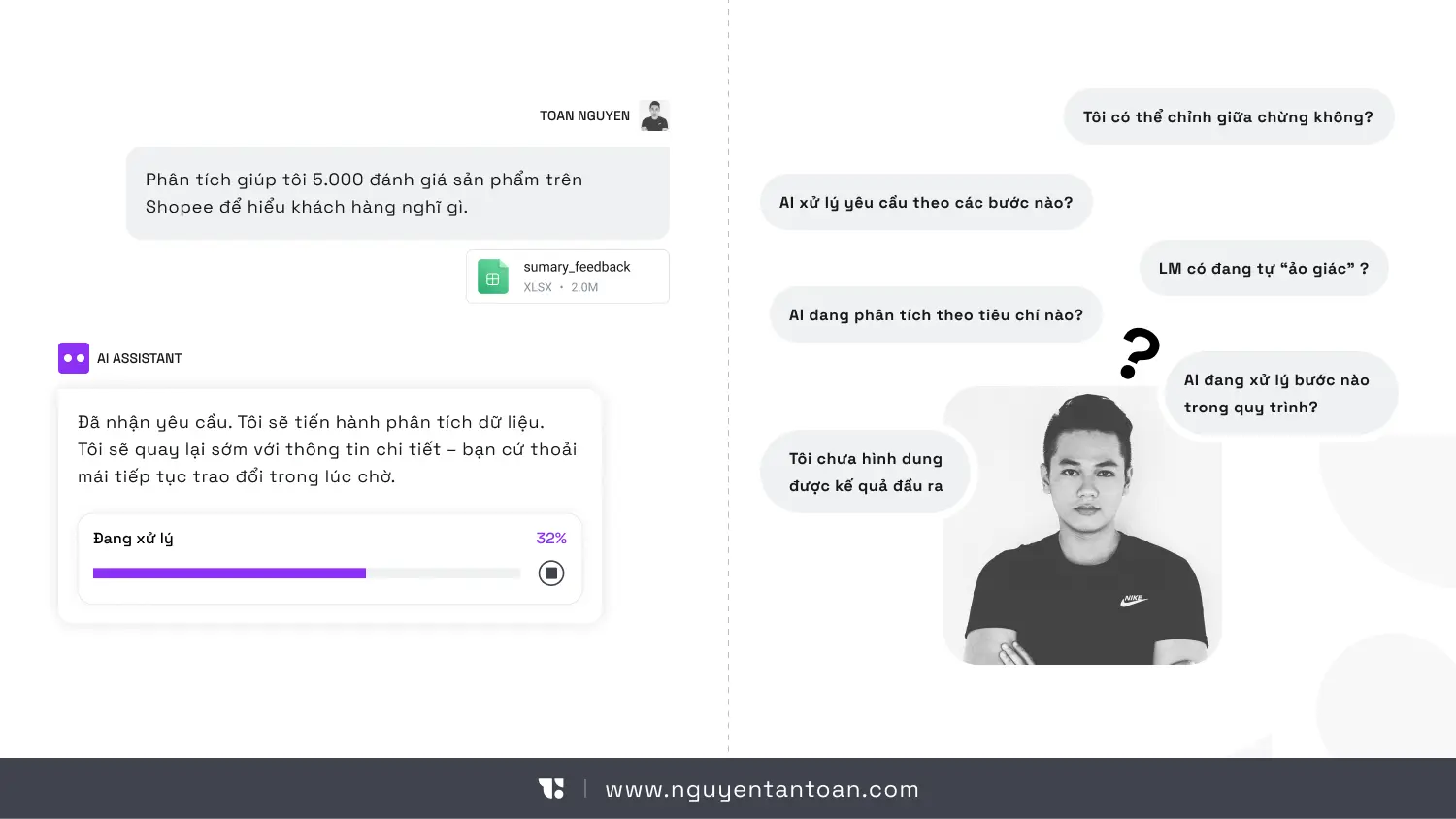
Imagine: On Monday, you ask AI to analyze 5,000 product reviews on Shopee to understand what customers think. On Tuesday, AI sends the report. You open it and are surprised: "Why did AI classify customers by shopping? I wanted classification by product issue!"
When AI runs for hours without a clear signal, users will be inundated with questions: Is it still running? Is it doing what I need? Is it stuck somewhere? And most importantly: Is it costing me money?
Some intelligent AI systems have started addressing this issue by asking clarifying questions before getting to work. For example, when you request market research, AI might ask back:
What price segment do you want to focus on?
Only independent coffee shops or include chains?
How detailed should the report be?
…
These simple questions can avoid hours of wrong-direction work.
2. No Way to Know Actual Progress.
Where is AI in the 7749-step process of handling requests? Is it gathering data, or analyzing? Is it writing the introduction or editing the conclusion? Is it headed in the right direction or lost in a delusion?
A spinning spinner isn’t enough. A fake loading bar is also useless. Users need to know: Which step are we at in the process? How much longer? What part is finished? Without this information, the experience becomes an endlessly frustrating black box.
3. Losing Context When Returning
AI running for a long time means users will leave to do other things. When they return after a few hours or the next day, they often don’t remember:
What exactly did I request?
What direction is AI processing?
What has been reviewed so far?
Think about this: You ask AI to analyze a marketing plan on Sunday evening. On Monday morning, you return and see the notification "78% completed." But 78% of what? You forgot what channel you asked for analysis on. You feel like an outsider in the conversation, having to go back to see previous discussion threads.
If the product doesn’t help users recall context, they will feel lost like an alien visiting Earth for the first time.
4. The Legendary "Blue Screen" Obsession
Imagine AI has been running for 8 hours, processing 80% of the work. Then suddenly, the system reports an error and... starts over from the beginning. That’s not just a technical disaster. That’s a collapse of trust. Users will think: "I’d never trust it with important tasks again."
When AI is Busy "Thinking," Users Need a New Interaction Experience
Jakob Nielsen proposes some noteworthy design directions. But to put it bluntly: this is not just an “additional feature,” but rather a transformation of the interaction model.
Here are the core principles:
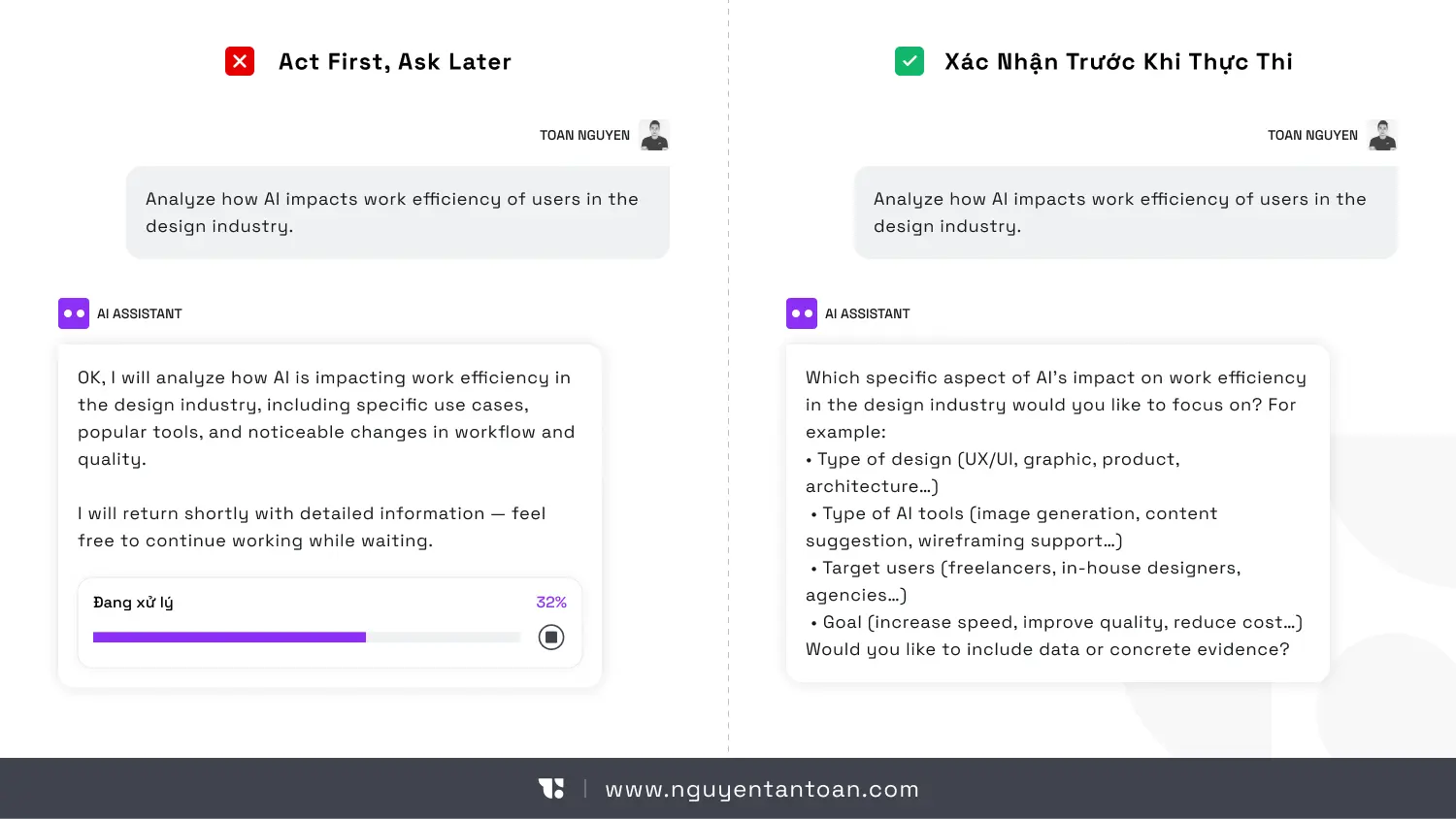
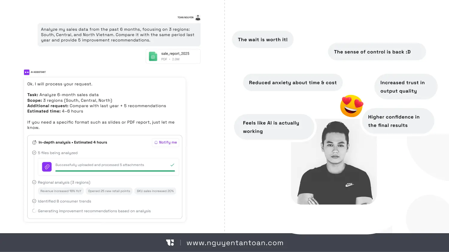
1. Confirm Before Execution
Before AI starts executing a long task like Agentic, Deep Research, etc., the system should ask users if they find the information still ambiguous.
Confirm the goal again
Display the scope of work
Output results
Estimate time and costs (if credits are used)
…
This creates transparency, enhances the sense of control. And most importantly, it avoids the shock of discovering after 10 hours that AI misunderstood the brief or that costs are ten times higher than expected.
2. Checkpoints to Avoid Wasting Efforts
A long task needs to be divided into clear milestones. For example:
Step 1: Uploaded 1500 documents
Step 2: Analyzed 1500 documents
Step 3: Searched for information from references
Step 5: Preliminary summary completed
Step 6: Summarizing and finishing the report
If an error occurs in step 3, the system should not start over but continue from the saved milestone. This is not just a technical issue. It’s a UX strategy to make the product friendlier to users.
3. Display Meaningful Progress
Not just “In Progress 40%.”
Users need to know what AI is doing:
Extracting data
Assessing reliability
Searching for information
Creating conclusions
…
This information helps AI become less mysterious, supporting users feel more secure.
4. Re-establish Context
When users return after a few hours, the system should display:
Summary of the initial request
What has been completed
Important decisions made
Next steps
Don’t make them read through the entire log.
5. Smart Notifications
Notifications should only appear when:
Task completed
Requires confirmation / Grant permissions
There’s a critical error
Too many notifications will make AI more of a nuisance than an intelligent assistant.
Slower AI is Actually a Sign of Maturity
Let’s be objective: If AI only needs 3 seconds to respond, it’s probably just doing simple tasks. AI begins to slow down when it's doing things that only humans could do before: independently creating detailed plans, executing hundreds of steps in workflows, connecting with multiple data sources, managing vast amounts of information. The issue isn’t how to make AI run faster (although that’s what everyone wishes). The real issue that needs to be addressed is: When speed is no longer instant, the experience must be upgraded. Think of waiting similarly to calling Grab to book a flight ticket. You call Grab, the car arrives in 5 minutes, and you wait in the app. Booking a flight for a trip 2 months later, you don’t sit waiting in front of the screen; you book and then go do other things, only receiving a confirmation email. Two completely different interaction methods for two different types of tasks.
If You Are Building an AI Product, Here Are the Real Questions
If you are developing an AI product, here are the questions that need to be answered:
Can users easily leave and return?
Do they feel they are in control of the AI's working progress?
If the system encounters an error midway, what will the impact on user experience be?
If you don’t have clear answers, your product is in a dangerous zone. Because users will hesitate to accept a tool, no matter how powerful, if it is unreliable. They will revert to old methods, using older products, even if they are slower but less risky.
Conclusion
AI slowing down is not a step backward. It’s a challenge for UX practitioners. As AI begins to solve complex problems like humans, interaction cannot simply be chat bubbles and waiting icons. AI needs to clearly demonstrate the execution process, have intelligent checkpoint systems, make the progress transparent, help users re-establish context, and notify at the right time and place. Without these elements, a dangerous paradox will occur: The stronger the AI, the harder the product is to use, leading to an increasingly poor user experience.
We have become accustomed to AI in the form of "instant response chat." Type a question, and a few seconds later, there’s an answer. The speed has almost become an implicit standard.
With the current outstanding development, AI tools like Agentic, Deep research, Reasoning, etc., can take dozens of minutes to perform tasks. Not because they are inefficient, but because they are tackling far more complex jobs.
You ask AI to analyze the company's entire email history over 3 years to identify trends in customer communication. Or you request AI to analyze 50 financial reports, compare them with 20 competitors, and then write a 30-page business plan. Or simply, you want AI to create a 5-minute product introduction video complete with animations, scene transitions, and voiceover.
These tasks cannot be completed in just a few seconds. According to some studies, Claude Sonnet 4.5 has run automatically for over 30 hours on some complex tasks. The duration of the most complex AI tasks doubles every 7 months, according to research by METR. Tasks that extend over several days will become common in the coming years as AI Automation, Transformative AI, etc., replace most human jobs.
Waiting is never favored in the user experience. But because we want more powerful AI to be able to handle extremely complex tasks, occasionally we must endure the wait. ****The issue is not technical; the issue is in user experience design.
When Waiting Becomes an Obsession
On a beautiful day, you get the idea to open a coffee shop. You open ChatGPT - Deep Research mode and type: "Please research the coffee market in Saigon over the past 3 years. Analyze the 20 main competitors, survey rental prices in each district, forecast consumer trends, and propose brand positioning strategies."
You hit Enter. And then... wait.
30 seconds. 1 minute. 5 minutes. 10 minutes
You start to wonder: "Does it understand the request correctly? What is it doing? Is it frozen? Should I refresh it?"
Then a message appears: "This task will take a few minutes. I will notify you when it’s completed. You can close this window and continue working on other tasks."
Welcome to the era of slow AI.
Worse Things Than Waiting
Waiting 30 seconds for AI to generate an image is a bit annoying. But waiting 30 minutes, 30 hours, or even 3 days? That’s an entirely different story. That poses a significant design challenge for UX designers. Your users may encounter some of the following issues.
1. Losing the Sense of Control
Imagine: On Monday, you ask AI to analyze 5,000 product reviews on Shopee to understand what customers think. On Tuesday, AI sends the report. You open it and are surprised: "Why did AI classify customers by shopping? I wanted classification by product issue!"
When AI runs for hours without a clear signal, users will be inundated with questions: Is it still running? Is it doing what I need? Is it stuck somewhere? And most importantly: Is it costing me money?
Some intelligent AI systems have started addressing this issue by asking clarifying questions before getting to work. For example, when you request market research, AI might ask back:
What price segment do you want to focus on?
Only independent coffee shops or include chains?
How detailed should the report be?
…
These simple questions can avoid hours of wrong-direction work.
2. No Way to Know Actual Progress.
Where is AI in the 7749-step process of handling requests? Is it gathering data, or analyzing? Is it writing the introduction or editing the conclusion? Is it headed in the right direction or lost in a delusion?
A spinning spinner isn’t enough. A fake loading bar is also useless. Users need to know: Which step are we at in the process? How much longer? What part is finished? Without this information, the experience becomes an endlessly frustrating black box.
3. Losing Context When Returning
AI running for a long time means users will leave to do other things. When they return after a few hours or the next day, they often don’t remember:
What exactly did I request?
What direction is AI processing?
What has been reviewed so far?
Think about this: You ask AI to analyze a marketing plan on Sunday evening. On Monday morning, you return and see the notification "78% completed." But 78% of what? You forgot what channel you asked for analysis on. You feel like an outsider in the conversation, having to go back to see previous discussion threads.
If the product doesn’t help users recall context, they will feel lost like an alien visiting Earth for the first time.
4. The Legendary "Blue Screen" Obsession
Imagine AI has been running for 8 hours, processing 80% of the work. Then suddenly, the system reports an error and... starts over from the beginning. That’s not just a technical disaster. That’s a collapse of trust. Users will think: "I’d never trust it with important tasks again."
When AI is Busy "Thinking," Users Need a New Interaction Experience
Jakob Nielsen proposes some noteworthy design directions. But to put it bluntly: this is not just an “additional feature,” but rather a transformation of the interaction model.
Here are the core principles:
1. Confirm Before Execution
Before AI starts executing a long task like Agentic, Deep Research, etc., the system should ask users if they find the information still ambiguous.
Confirm the goal again
Display the scope of work
Output results
Estimate time and costs (if credits are used)
…
This creates transparency, enhances the sense of control. And most importantly, it avoids the shock of discovering after 10 hours that AI misunderstood the brief or that costs are ten times higher than expected.
2. Checkpoints to Avoid Wasting Efforts
A long task needs to be divided into clear milestones. For example:
Step 1: Uploaded 1500 documents
Step 2: Analyzed 1500 documents
Step 3: Searched for information from references
Step 5: Preliminary summary completed
Step 6: Summarizing and finishing the report
If an error occurs in step 3, the system should not start over but continue from the saved milestone. This is not just a technical issue. It’s a UX strategy to make the product friendlier to users.
3. Display Meaningful Progress
Not just “In Progress 40%.”
Users need to know what AI is doing:
Extracting data
Assessing reliability
Searching for information
Creating conclusions
…
This information helps AI become less mysterious, supporting users feel more secure.
4. Re-establish Context
When users return after a few hours, the system should display:
Summary of the initial request
What has been completed
Important decisions made
Next steps
Don’t make them read through the entire log.
5. Smart Notifications
Notifications should only appear when:
Task completed
Requires confirmation / Grant permissions
There’s a critical error
Too many notifications will make AI more of a nuisance than an intelligent assistant.
Slower AI is Actually a Sign of Maturity
Let’s be objective: If AI only needs 3 seconds to respond, it’s probably just doing simple tasks. AI begins to slow down when it's doing things that only humans could do before: independently creating detailed plans, executing hundreds of steps in workflows, connecting with multiple data sources, managing vast amounts of information. The issue isn’t how to make AI run faster (although that’s what everyone wishes). The real issue that needs to be addressed is: When speed is no longer instant, the experience must be upgraded. Think of waiting similarly to calling Grab to book a flight ticket. You call Grab, the car arrives in 5 minutes, and you wait in the app. Booking a flight for a trip 2 months later, you don’t sit waiting in front of the screen; you book and then go do other things, only receiving a confirmation email. Two completely different interaction methods for two different types of tasks.
If You Are Building an AI Product, Here Are the Real Questions
If you are developing an AI product, here are the questions that need to be answered:
Can users easily leave and return?
Do they feel they are in control of the AI's working progress?
If the system encounters an error midway, what will the impact on user experience be?
If you don’t have clear answers, your product is in a dangerous zone. Because users will hesitate to accept a tool, no matter how powerful, if it is unreliable. They will revert to old methods, using older products, even if they are slower but less risky.
Conclusion
AI slowing down is not a step backward. It’s a challenge for UX practitioners. As AI begins to solve complex problems like humans, interaction cannot simply be chat bubbles and waiting icons. AI needs to clearly demonstrate the execution process, have intelligent checkpoint systems, make the progress transparent, help users re-establish context, and notify at the right time and place. Without these elements, a dangerous paradox will occur: The stronger the AI, the harder the product is to use, leading to an increasingly poor user experience.
RELATED ARTICLE
RELATED ARTICLE
RECENT POST
RECENT POST


ACCESSIBILITY
I believe that good design should be for everyone and am always committed to providing the most accessible experience. If you have trouble accessing the website, feel free to leave me a message.
NOTE
Website Design and Development by Toan Nguyen. Using the font Space Gortek (Colophon Foundry); Newseader (Production Type). Built on the Framer platform.
Copyright © 2018 – 2025 Toan Nguyen