When AI needs time to "think": designing UX for long-running tasks
Here is the paradox - the more powerful AI gets, the "slower" it becomes. As the technology starts solving problems as complex as the ones people handle, the experience of interacting with it has to change too. If the experience can't keep up with the power of the technology, users will walk away, no matter how smart the AI is.

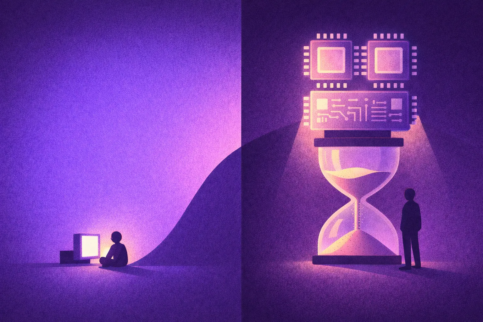
We have gotten used to AI as a chat that answers instantly. Type a question, get an answer a few seconds later. Near real-time speed has become the unspoken standard.
With the leaps the field is making, AI tools such as agents, deep research and reasoning models can now take tens of minutes to carry out a task. Not because they are bad, but because they are doing far more complex work.
You ask AI to analyze three years of your company's email history to find patterns in how you communicate with customers. Or you ask it to analyze 50 financial reports, compare them against 20 competitors, and write a 30-page business plan. Or, more simply, you want it to create a 5-minute product intro video complete with animation, transitions and voiceover.
None of this can happen in a few seconds. According to some reports, Claude Sonnet 4.5 has run autonomously for more than 30 hours on certain complex tasks. The length of the most complex tasks AI can complete is doubling every 7 months, according to research from METR. Tasks that run for days will become common in the next few years, as AI automation and transformative AI take over most of the work people do.
Waiting has never been popular in user experience. But because we want more powerful AI that can handle extremely complex tasks, we will sometimes have to put up with waiting. The problem is not a technical one. The problem is user experience design.
When waiting becomes a source of dread
One day you come up with the idea of opening a coffee shop. You open ChatGPT in Deep Research mode and type: "Research the coffee market in Saigon over the past 3 years. Analyze the 20 main competitors, survey rental prices by district, forecast consumer trends, and propose a brand positioning strategy."
You hit Enter. And then... you wait.
30 seconds. 1 minute. 5 minutes. 10 minutes.
You start to wonder: "Did it understand the request? What is it doing? Is it frozen? Should I refresh?"
Then a line of text appears: "This task will take a few minutes. I'll notify you when it's done. You can close this window and carry on with other work."
Welcome to the era of slow AI.
The things that are worse than waiting
Waiting 30 seconds for AI to generate an image is mildly annoying. But waiting 30 minutes, 30 hours, or even 3 days? That is a completely different story, and a major design challenge for UX people. Your users may run into some of the following problems.
1. Losing the sense of control
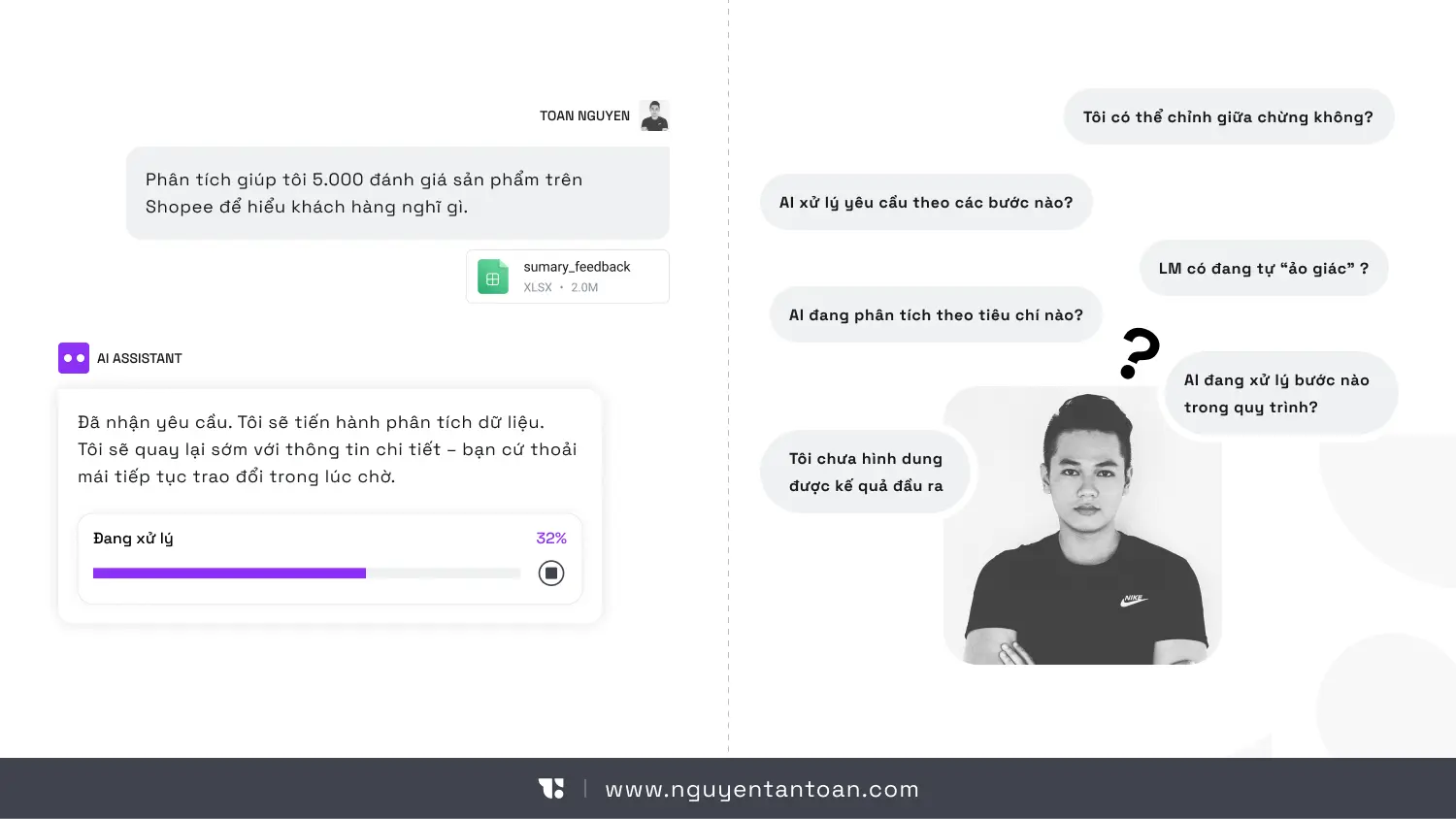
Picture this: on Monday, you ask AI to analyze 5,000 product reviews on Shopee to understand what customers think. On Tuesday, the AI sends its report. You open it and are caught off guard: "Why did it group the reviews by type of shopper? I wanted them grouped by product issue!"
When AI runs for hours without clear signals, users are flooded with questions: Is it still running? Is it doing what I actually need? Is it stuck somewhere? And most important of all: Is it costing me money?
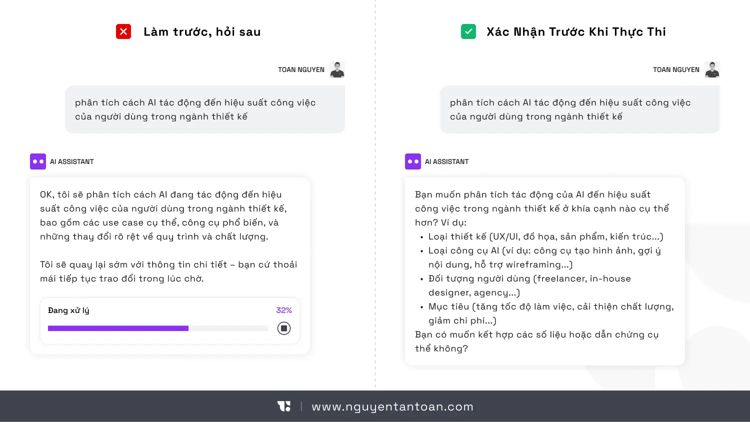
Some smart AI systems have started to address this by asking clarifying questions before getting to work. For example, when you ask for market research, the AI might ask:
- Which price segment do you want to focus on?
- Independent coffee shops only, or chains as well?
- How detailed should the report be?
- ...
These simple questions can prevent hours of work in the wrong direction.
2. No way to know the real progress
Where is the AI in its seemingly endless sequence of steps? Is it collecting data or analyzing it? Writing the opening or revising the conclusion? Is it on the right track, or lost in a hallucination?
A spinning spinner is not enough. A fake loading bar is useless too. Users need to know: Which step of the process are we on? How much longer? Which parts are done? Without that information, the experience becomes an uncomfortably long black box.
3. Losing context when you come back
When AI runs for a long time, users will leave to do other things. When they come back a few hours later or the next day, they often can't remember:
- What exactly did I ask for?
- Which direction is the AI taking?
- What have I already approved?
Think about it: you ask AI to analyze a marketing plan on Sunday night. On Monday morning you come back to a notification that says "78% complete." But 78% of what? You have forgotten which channels you asked it to analyze. You feel like an outsider in your own conversation, scrolling back through earlier messages to catch up.
If the product doesn't help users recover their context, they will feel as lost as an alien visiting Earth for the first time.
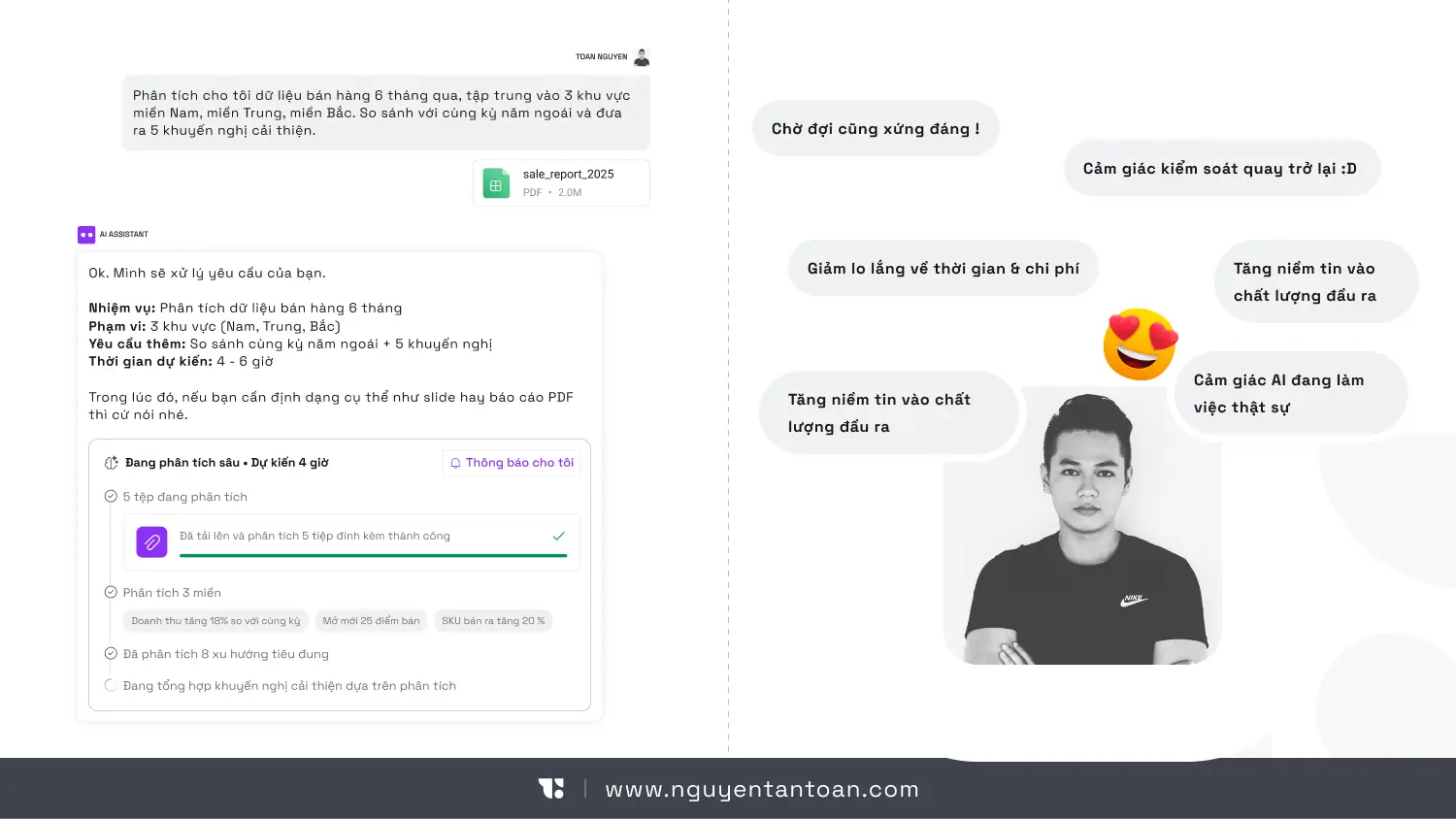
4. The dread of the legendary "blue screen"
Imagine the AI has been running for 8 hours and has finished 80% of the job. Then the system suddenly throws an error and... starts over from scratch. That is not just a technical disaster. It is a collapse of trust. The user will think: "I'm never handing it anything important again."
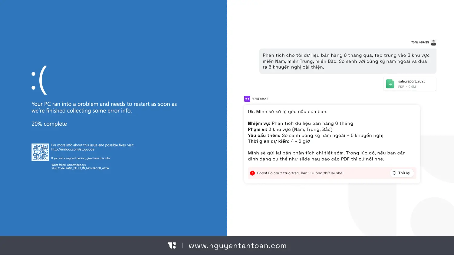
When AI is busy "thinking," users need a new interaction model
Jakob Nielsen has proposed several design directions worth paying attention to. But to put it bluntly: these are not just "extra features." They are a shift in the interaction model.
Here are the core principles:
1. Confirm before executing
Before the AI starts a long task such as an agentic workflow or deep research, the system should check with the user whenever something is still ambiguous:
- Restate the goal
- Show the scope of work
- The expected output
- Estimated time and cost (if credits are used)
- ...
This creates transparency and a stronger sense of control. Most important of all, it avoids the shock of discovering 10 hours later that the AI misread the brief, or that the cost is 10 times what you expected.
2. Checkpoints so work is never lost
A long task needs to be broken into clear milestones. For example:
- Step 1: Uploaded 1,500 documents
- Step 2: Analyzed 1,500 documents
- Step 3: Searched reference sources for information
- Step 4: Drafted a preliminary synthesis
- Step 5: Summarizing and finishing the report
If an error occurs at step 3, the system should not start over from the beginning. It should resume from the last saved checkpoint. This is not only a technical matter. It is a UX strategy that makes the product friendlier to its users.
3. Show progress that means something
Not just "40% complete."
Users need to know what the AI is doing:
- Extracting data
- Assessing reliability
- Searching for information
- Drawing conclusions
- ...
This kind of information makes AI less mysterious and helps users feel more at ease.
4. Restore context
When users come back after a few hours, the system should show:
- A summary of the original request
- What has been completed
- The important decisions that were made
- The next steps
Don't make them reread the entire log.
5. Smart notifications
Notifications should only appear when:
- The task is complete
- Confirmation or permission is needed
- A significant error has occurred
Too many notifications turn AI into a nuisance instead of a smart assistant.
Slower AI is actually a sign of maturity
Let's look at this objectively: if AI needs only 3 seconds to answer, it is probably only doing simple things. AI starts to slow down when it does work that only people could do before: drawing up a detailed plan on its own, carrying out a process with hundreds of steps, connecting to many different data sources, handling enormous volumes of information. The question is not how to make AI run faster (although everyone wants that). The real problem to solve is this: when speed is no longer instant, the experience has to be upgraded. Think of the difference between hailing a Grab and booking a flight. You request a Grab, the car arrives in 5 minutes, and you wait in the app. You book a flight for a trip 2 months away, and you don't sit waiting in front of the screen. You book it, get on with other things, and just receive a confirmation email. Two completely different ways of interacting for two different kinds of tasks.
If you are building an AI product, these are the real questions
If you are building an AI product, these are the questions you need to answer:
- Can users leave and come back easily?
- Do they feel in control of the AI's work as it progresses?
- If the system fails midway, how much damage does that do to the user experience?
If you don't have clear answers yet, your product is in the danger zone. Users will be reluctant to adopt a tool that is powerful but unreliable. They will go back to the old way of working and the old product, slower but less risky.
Conclusion
AI getting slower is not a step backward. It is a challenge for UX practitioners. Once AI starts solving problems as complex as the ones people handle, the interaction can't be just chat bubbles and a loading icon. AI needs to show clearly how it is carrying out the work, with smart checkpoints, transparent progress, help for users to restore context, and notifications at the right time and place. Without these, a dangerous paradox sets in: the more powerful the AI, the harder the product is to use, and the worse the user experience becomes.